We decided to build a model to predict whether a stop would result in a frisk, rather than an arrest. Based on the results of the linear regression, there appears to be more variability regarding frisks, likely leading to a more interesting model. An arrest is a fairly objective decision that can be predicted based on the law. However, an officer has more discretion regarding whom to frisk, which would make a machine learning model that could predict human behavior potentially more interesting.
Relying on the same dataset used in the linear regression, we built a K-Nearest Neighbors predictive model in Python. The first step was to import the pertinent libraries and upload the data.

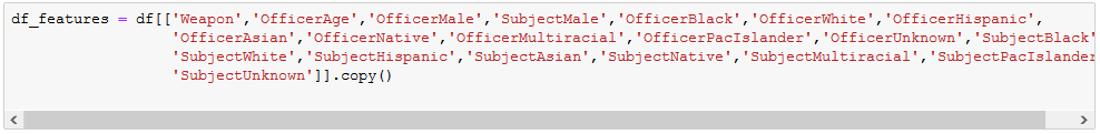
We then pared down the dataframe to only the columns of interest for our model (df_features), excluding the ‘Frisked’ variable, which is the outcome that we want to predict.
As is common in machine learning exercises, we divided the dataset into two sections: one used to build the model and the other to test the accuracy of the model that we just built. We built our model using on 75% of the dataset (the Training Set). The remaining 25% (the Test Set) was used to test the accuracy of the model. In building the model, Python only considers the data in the Training Set. We then employ that model to predict the values of the Test Set. Because we know from the data which subjects were frisked in reality, we can compare the values that the model predicted to the actual values to determine how accurate our model is.

In the above, X are the variables used to predict the outcome and y is the variable that is predicted (Frisked).
(Very) Brief KNN Overview
KNN groups the data into sections. Imagine a 2-dimenionsal graph that plots the data along two axes, X and Y. Further imagine that your dataset can be divided has 2 distinct groups, with one group plotted towards the lower left-hand corner of the graph and the second plotted towards the upper right-hand corner of the graph. These are your two “neighbors”. Now, let’s assume that you have an additional point that is plotted somewhere between the two neighbors and you want to determine which neighborhood this new point should be grouped with. KNN looks at the already established groups, or neighbors, and assigns the new point to the closest neighbor. In other words, if the new point is plotted a bit closer to Group 1 than Group 2, KNN will assign the new point to Group 1, its nearest neighbor. That is easy to understand visually if you only have 2 or 3 groupings, but if you have, for example, 15 groupings, it becomes a bit more difficult. In this exercise, we start out with just 2 groupings to see how the model performs and then make adjustments as necessary.

The two primary components of our accuracy measurement are precision and recall. Precision measures what percentage of the model’s predictions were accurate. For example, if it predicted that there were 150 frisks and 75 of those predictions were correct, the precision would be 50% (75/150). The recall measures what percentage of the total the model predicted correctly. In other words, if the model predicted the same 75 frisks, but there were actually a total of 300 frisks in the entire dataset, the recall would be 25% (75/300)
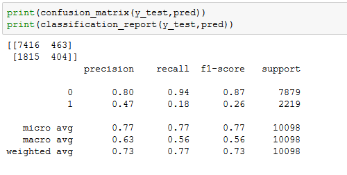
In the above results, the precision and recall for non-frisks was really good, at .80 and .94, respectively. However, it did not do so well with predicting the stops that resulted in a frisk with a precision of .47 and recall of 0.18. One way to try to improve the model is to adjust the number of groups. Choosing a more accurate number of groups can be done by employing the “Elbow Method”, which iterates through several different group sizes to find the best one, the one with the lowest error rate.
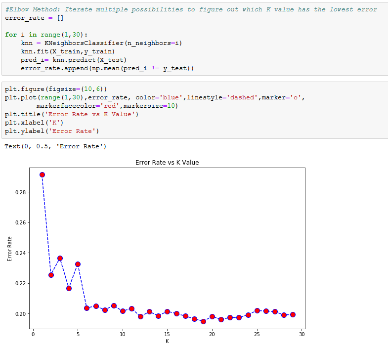
Here you can see that there is a large drop off from around k=5 to k=6, with k=6 having a much lower error rate than or original k=2. Therefore, k=6 could be a good choice, but looking further, the error continues to drop. We tried a few values for k along that range and settled on k=12.

You can see from the above results that compared to our original k=2, our precision and recall measurements for no-frisks increased slightly. Turning to frisks, the precision increased dramatically from 0.47 to 0.71, but recall unfortunately fell from an already low .18 to an even lower .16.
In summation, our model was accurate in its predictions in that there were a low number of false positives in both the frisk and non-frisk predictions. However, there were a very large number of false negatives for the frisked predictions. In other words, if the model predicts that a stop will result in the subject being frisked, we can be fairly certain that it is correct, but if it predicts that a subject will not be frisked, there’s a really good chance that it’s wrong.
End Notes
The purpose of this post was to demonstrate the KNN technique using actual data. If running a similar analysis in the real world and you are confronted with divergent precision and recall readings as we have here, you will need to decide whether it is most important to minimize false positives (high precision value) or minimize false negatives (high recall value).
If you’re interested, we ran the model on the entire dataset and included a column that displayed the actual value and the predicted value for each Terry stop so that you can compare the results. This can be found on our GitHub page. You can also find on GitHub the original dataset, the Stata tables from the linear regressions, and the full Python code.
Thanks to the City of Seattle for freely sharing their data. This dataset as well as many others can be found on the city’s Open Data Portal.