Now that we’ve merged our datasets and cleaned the data, we now move onto getting a feel for the data tells us through Exploratory Data Analysis.
Descriptive Stats
First, let’s pull some descriptive stats for our numeric variables
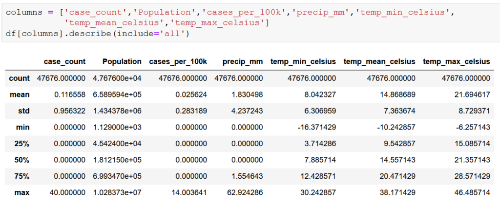
This first step doesn’t tell us much, other than that the data seems to make sense at first glance. Monthly cases range from 0 to 40. Low temperatures ranges from -16.4 degrees to 30.2 degrees Celsius and high temperatures range from 21.7 degrees to 46.5 degrees Celsius. One can expect wide temperature swings in data covering the entire year in a state as large as California. The same goes for precipitation. Median monthly precipitation of 0.0 mm might be a red flag in most states, but in a state as notoriously dry as California, it makes sense considering that the data is by county and not for the entire state. However, case_count figures with 0 cases through the 75th percentile could prove to be problematic given that is the variable that we are attempting to predict. Overall, the data looks good with no apparent major outliers.
Next, we looked at the completeness of the data be counting all of the null values present in the dataframe.

No null values. So the absence of apparent outliers and lack of null values suggests that our data merging and cleaning process was successful.
Plotting Primary Variables
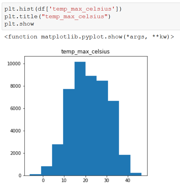
Our primary variables for this exercise are the total number of cases of WNV per county per month (case_count), the average temperature per county per month (temp_min/mean/max_celsius), and the average precipitation per county per month measured in millimeters (precip_mm). To get a sense of how these variables vary by county, we plotted each totaling/averaging the feature for the entire period (2006-2020).
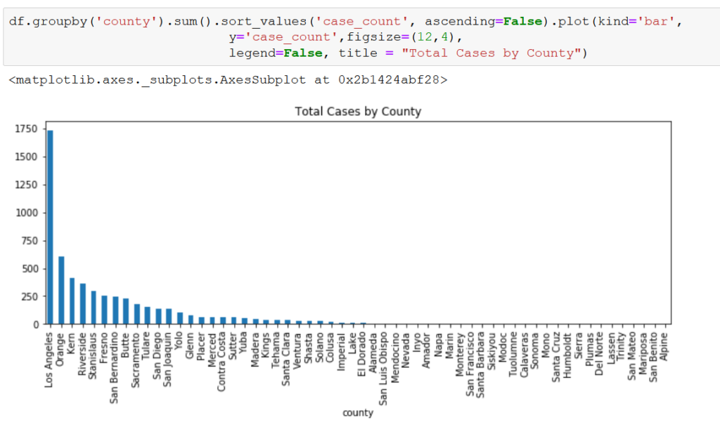
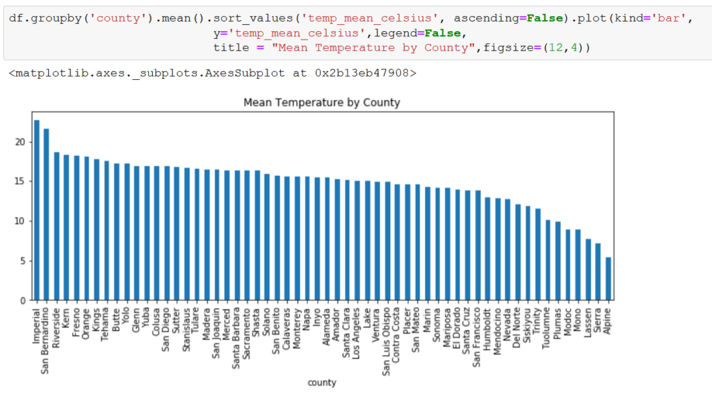

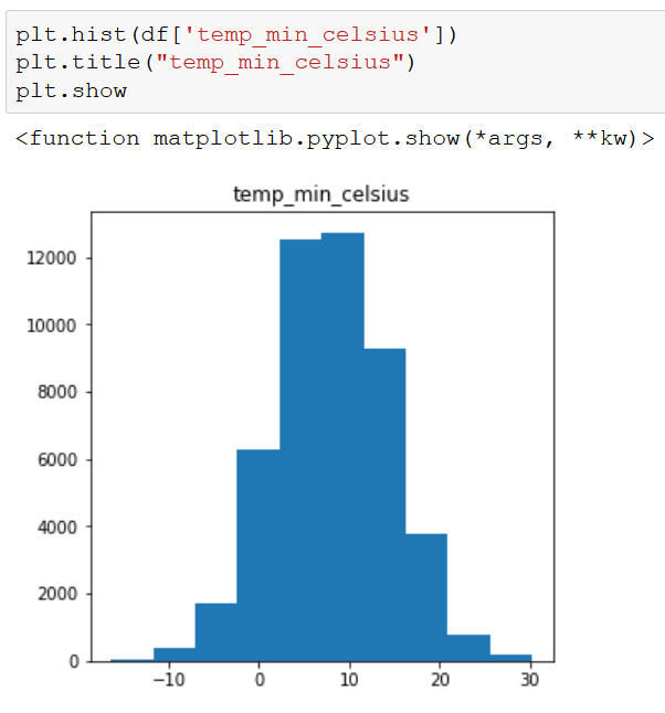
There is a huge variation among counties for case_count and precip_mm, but less so for temp_mean_celsius. Taking a deeper look at our independent variables, we see that the temperature variables are fairly normally distributed, while precip_mm is skewed to the right.


Based on these initial findings, it appears that precip_mm may pose a challenge in building our model. We will at least need to do some sort of transformation to induce normality if we choose a linear regression model. At worst, we may have to drop the variable all together if there isn’t much correlation between precip_mm and case_count.
Initial Correlation Exploration
Before going down the path of building a model to predict case_count, we wanted to get an idea of whether there is any relationship between our independent and dependent variables. Focusing just on temp_mean_celsius as our temperature variable, we ran a correlation table and matrix.

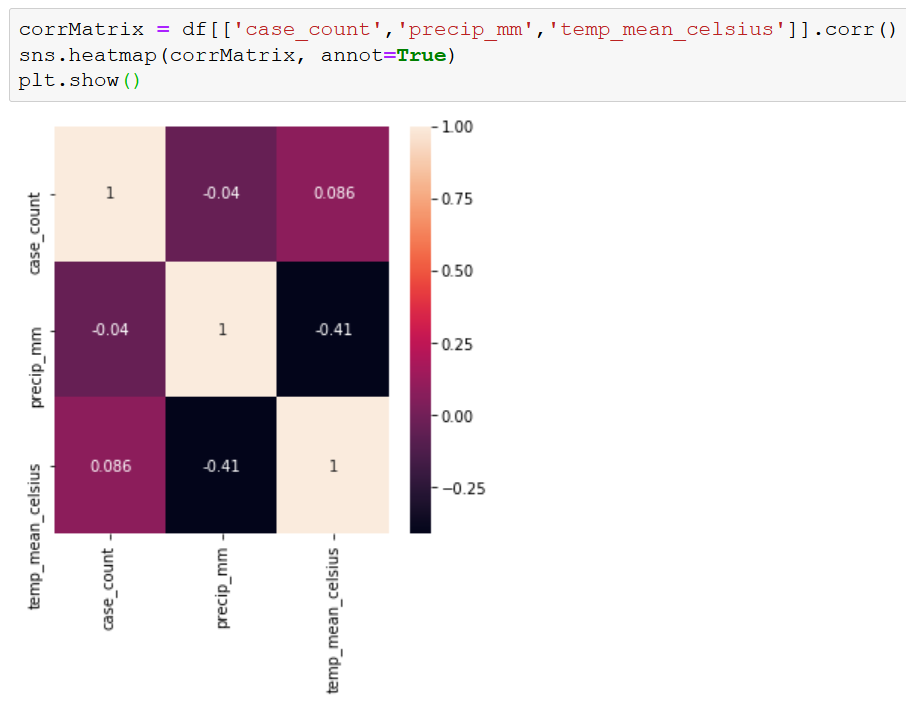
So far, it doesn’t look very promising. However, the low correlations may be due to how our data is structured. A correlation matrix works pretty well with time series data in general, but our data is also organized by county, which may be too complicated for a simple correlation reading.


The scatter plots seem to be more useful. There appears to be a higher number of cases when the weather is warmer. This aligns with expectations. WNV is transmitted by mosquitoes, and mosquitoes like hot weather. There seems to be less of a relationship between case_count and precip_mm. Mosquitoes lay their eggs in or near water, so we assumed that at higher levels of precipitation there would be more mosquitoes, which would lead to more cases of WNV. That assumption does not seem to be supported by the data. Precipitation is so low in many parts of California that there just may not be enough to make a connection between our two variables. Mosquitoes need water, but it doesn’t have to come from rainfall. The precip_mm could be a good proxy for the presence of water in general, but maybe not in California specifically.
Model Specifications
Giving some thought to the relationship between the nature of mosquitoes and our variables, there is a question of timing. Mosquitoes emerge as the temperature increases, but it takes time for them to find water, breed, mature, and then start biting humans. Therefore, there could be a delay between our independent variables and our dependent variable.
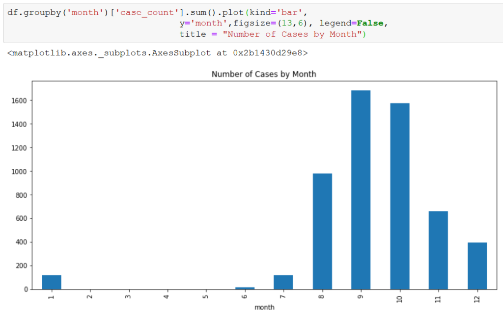
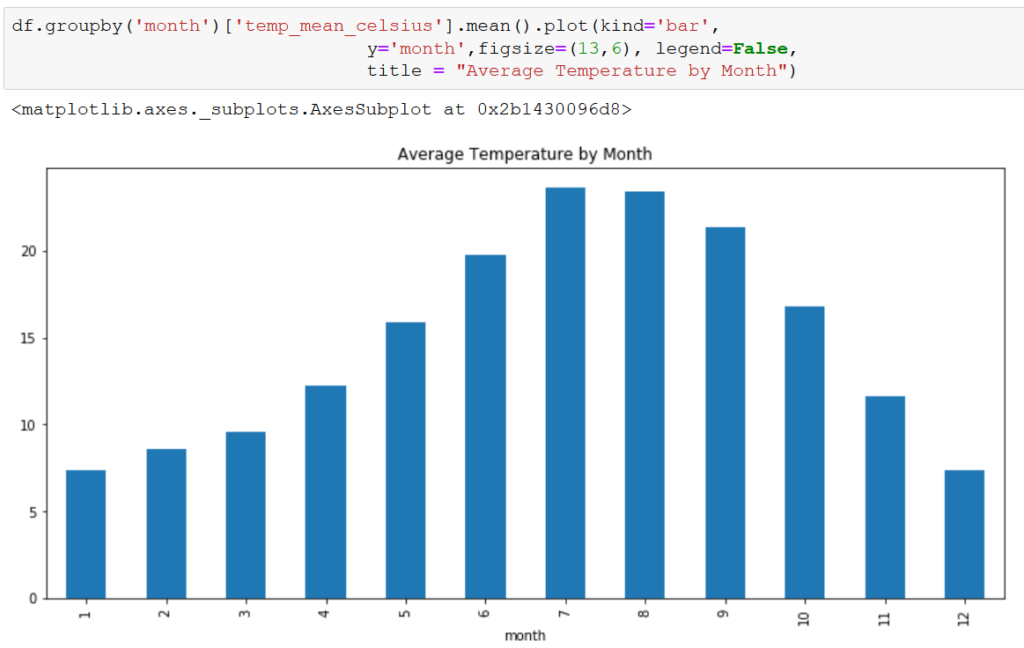

There does appear to be a delay between an increase in temp_mean_celsius and case_count, with temp_mean_celsius peaking in July/August and case_count peaking in September/October. Again, precip_mm doesn’t appear to share the relationship.
Based on this delay, we may explore mimicking the delay in our model by shifting the case_count by 2 months to better match the temperature increase with the increase in cases.
Closing
We also segmented the data by season and by region and ran a similar analysis. The findings were similar to the above, so we won’t detail them here. However, we did include them in the coding workbook in our GitHub repository.
This concludes the EDA portion of the analysis. In our next post, we’ll build a model to predict case_count.